English
 Deutsch
Star trek borg: Inside the star trek borg Ecosystem
Think of this as a guided tour through the machinery behind the Collective—an exploration of the design, sound, engineering, and transmedia decisions that shaped the Borg on screen and beyond. We’ll assume you already know the basics: assimilation, adaptation, a cube on the viewscreen that does not slow down. What’s missing from the usual summaries is the how and why: the abandoned insectoid concept that almost set the tone; the prosthetic systems designed for speed, repetition, and legibility; the low, omnipresent hum and the chorus-processed voices that told you the room was not empty, even when it was.
We’ll track how a handful of designers and sound editors forged a visual and sonic identity that survived shifts in budget, scheduling, and tone—from early TNG through films and into later series. We’ll parse the engineering logic of the cube, the oft-quoted dimensions that drift from source to source, and what is on-screen fact versus best-guess inference. We’ll examine cross-media echoes—games, guides, and novels—that sometimes anticipated televised choices. And we’ll read the language—“Resistance is futile”—as both narrative device and pop-cultural meme.
In short, this is a star trek borg dossier that privileges the production floor and the mixing stage as much as the diegetic story, a way of seeing the Collective as an ecosystem of design decisions rather than just a single enemy.
borg star trek Origins: Production Design and Abandoned Concepts
Before cybernetic pallor and ribbed tubing became the visual shorthand, the production team explored a very different direction. Memos and interviews from the period describe early talk of an insectoid enemy—an idea that would have leaned into chitinous armor, multi-limbed silhouettes, and segmented movement. The attraction was clear: insect imagery conveys hive logic and relentless efficiency. The drawbacks were equally clear in practical terms. In 1980s television, large, articulated creature suits were expensive to build, heavy to wear, and unforgiving on camera. Facial performance would be buried. Stunt work would be constrained. And crucially, a recurring villain of that complexity risked becoming unshootable on a weekly schedule.
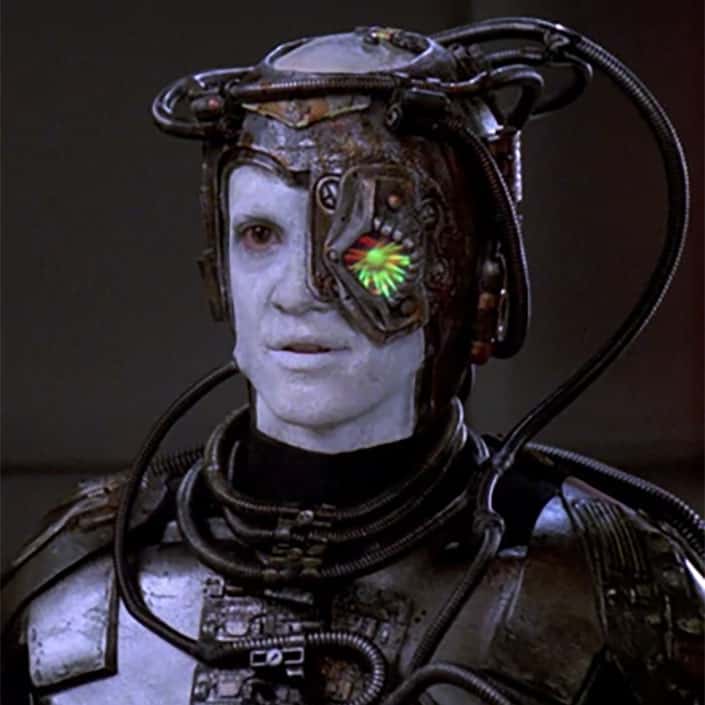
Pivoting toward cybernetics solved several problems at once. Michael Westmore’s makeup department began to iterate modularly: vacuum-formed plates that could be trimmed to fit, silicone and foam appliances keyed to hotspots on the face and neck, and off-the-shelf cabling rerouted as “vascular” detail. The team learned where articulation had to be preserved—jaw, eyes, shoulder turn—and where rigid detail could live without compromising performance. Once hero looks were established, Westmore’s shop prioritized repeatability. A language of interchangeable parts emerged: standardized ocular implants, forearm cuffs, chest carapaces, and a family of hoses that could be swapped or mirrored to diversify background drones without reinventing the silhouette.
The collaborative aesthetic extended beyond prosthetics. Rick Sternbach’s tech sensibilities favored designs that looked assembled, not sculpted—panels that locked into latticework, conduits that felt like load-bearing arteries. Michael Okuda’s era-defining graphical language—readable, geometric, and systematic—bleeds into Borg interfaces even in their abnormalities. You can feel a “logic of grids” at work: nodes, repetition, and hard edges. If Federation consoles spoke in clean bands and pastel ergonomics, Borg surfaces declared their priorities in high-contrast geometry and pulsing indicators—a visual signal that the interface was the organism.
These choices did more than save time and money. They created a villain that read immediately at medium distance. The combination of desaturated skin, asymmetrical implants, and synchronized blocking told the audience “collective” without the need for exposition. And because the vocabulary was modular, it allowed for later updates in films and subsequent series: more biomechanical textures, more integrated LEDs, a gradient from utilitarian to nightmarish, all while remaining recognizably Borg. In the language of borg star trek production, the Collective was engineered for continuity.
the borg star trek Aesthetics and Sound: Makeup, Music, and Motifs
The sonic identity of the Collective was built to match the makeup and costume logic. Once the drones looked like ambulatory machinery, the sound department gave them a room tone—low mechanical hums and circulating air—that followed them like an aura. When the camera entered a cube or a corridor of regeneration alcoves, the noise floor told you as much as the lighting did. The drones’ voices—processed with filtering, slight chorusing, and phase to imply many mouths speaking one thought—transformed even simple lines into a presence that felt distributed and inescapable.
Motifs became cues for story and theme. Segmented plating telegraphed modularity. Surface cabling evoked not just function but dependency; remove it, and the drone falters. Ocular implants framed the face like targeting reticles, shrinking the human gaze into a sensor port. Movement—slowed, synchronized, then explosively efficient when needed—made the drones’ humanity legible only in its suppression. As cinematography and scoring layered on dread, each design choice doubled as narrative: you are looking at a civilization that values interchangeability over individuality.
Assimilation sequences required planning across departments. On set, stunt teams and makeup coordinated the “bite” of tubules and the mechanics of a fall or capture. Post-production then sweetened the action: a wet, pressurized hiss as the tubules punctured skin; a swarmy, microscopic sparkle to suggest nanoprobes at work; a rising tone bed that intimated system takeover. The detectable “clicks” and servo twitches in close-ups—especially in later film treatments—are editorial punctuation that make the body feel like a device.
Budget and time constraints turned out to be aesthetic anchors. Reusable costume rigs demanded consistent entry points for cables and prosthetics, which in turn standardized where light could live on a suit and where sound could focus attention. Voice processing presets kept dialogue clear during fast mixes while retaining the signature collective timbre. Even the rhythmic beeps associated with certain panels reuse families of tones, creating a mnemonic link between different sets and episodes. Constraints did not just limit choice; they codified the borg star trek look and feel, giving the Collective an audio-visual grammar that survives reinterpretation.
star trek the borg: Engineering Realities, Cube Dimensions, and Densities
On the numbers, one figure is quoted more than any other: a cube with a side length of roughly 3 kilometers. That implies a raw volume around 27 cubic kilometers, though screen appearances do not always maintain fixed scale. In early TNG, some visual effects shots suggest smaller or larger proportions depending on the composition and the ship used for comparison. Films later leaned into a grander sense of mass. The takeaway is less the precise measurement than the intention: the cube dwarfs a starship on purpose, reducing Federation silhouettes to insects against a monolith. Where sources diverge, it is safest to treat “about 3 km per side” as a production shorthand for “overwhelming.”
Interior logic aligns with that mass. Sets and graphics imply modular corridors that feed into service trunks, with regeneration alcoves distributed like charging stations along a cellular grid. The impression is of infrastructure that does not have a single bridge or engine room but rather a distributed control architecture—a network that can reroute around damage. You see the effect whenever the camera tracks past repeating bays: redundancy as design principle. This meshes with characterization of the Queen as an avatar or focal point rather than a solitary brain; the cube remains operable even when the avatar is absent, though performance appears to degrade.
Hull materials and durability are conveyed through interaction. Phasers and torpedoes often splash or embed before adaptation renders them ineffective; tractor beams and cutting lasers persist through shields as if the cube could modulate rather than merely block. The word “polyalloy” surfaces in dialogue, but the actual composition is left unspecified. The on-screen truth is performance, not chemistry: high tolerance to energy, rapid local repair, and the ability to operate at partial integrity. When a face of the cube can be perforated and the vessel continue, you are meant to read lattice and load distribution, not a central keel.
Mass and density can only be inferred. The cube carries thousands of drones at minimum during its prime-era appearances; the number scales with the story. Ventral bays imply hangars for spheres or smaller craft, and we see shock-absorbing scaffolds that suggest the cube is designed to take internal impacts. Cross-sections shown as schematics—especially in later series—depict a fractal texture: rooms nested within rooms, conduits within conduits. If you treat the cube as a matrix of corridors, alcoves, conduits, and voids, then the “27 cubic kilometers” is not solid: much of it is breathable space and service volume.
Canon vs. speculation
- Firmly on screen: Cubes can adapt to energy signatures; drones regenerate in alcoves; control is distributed; the Queen functions as a voice for the Collective; the cube’s size is portrayed as vastly larger than a Starfleet cruiser.
- Variable or staged for effect: Exact cube dimensions; drone counts; the specific composition of hull materials; energy budgets for adaptation; the extent to which a Queen is required for tactical decision-making.
- Cross-media, suggestive but not definitive: Technical guides and licensed games echo a 3 km figure and emphasize modular bays and decentralized systems. Titles like Star Trek: Armada and Star Trek Online depict spheres, diamonds, and tactical cubes with related engineering implications, but these do not fix canon across televised appearances.
Treat “star trek the borg” engineering as a tapestry woven from on-screen behavior first, then framed by production design logic. The point of the cube is not the number; it is the feeling of inevitability.
Transmedia Echoes and Continuity
Across television and film, the Borg are both constant and revised. In TNG, the drones’ look evolves rapidly from early makeups to a more systematized, industrial aesthetic. The philosophy is declared early—assimilation as method, adaptation as defense—but the visual grammar tightens as the production learns what reads on camera. DS9 rarely stages direct encounters yet lives in the shadow of Wolf 359; its sets and logs carry the weight of aftermath and the tactical recalibrations that follow. Voyager becomes the laboratory, expanding the toolkit: more specialized drones, spheres and tactical cubes, a Queen as recurring figure, and the introduction of regenerative interiors that become instantly legible as Borg spaces.
Picard reframes and extends. Season 1’s Artifact shows maintenance and research around derelict Borg architecture, with design emphasizing scaffolding, hazard signage, and cultural interfaces—how other societies move through Borg space without being of it. Seasons 2 and 3 introduce variations that test long-standing assumptions: distinct entities and provisional alliances that complicate the binary of Collective versus individual. These appearances preserve the sonic and visual signifiers—hum, ocular implants, green bioluminescence—while allowing political and philosophical nuance to enter without erasing legacy. Fan responses have ranged from enthusiastic about the deeper world-building to cautious about continuity; official materials have generally framed these moves as revelations of scope, not retcons.
Transmedia often functions as a testing ground. Novels have long explored ex-drones reclaiming identity and the infrastructural realities of a cube in transit. Games, by their nature, must model capabilities numerically; they introduce ranges for adaptation, cooldowns for regeneration, and supply chains for assimilation—all mechanics that can inspire how later shows visualize process. Divergences remain, and they should. The rule of thumb is that the borg star trek seen on a licensed page or in a mission briefing may infer plausible systems, but the televised and filmed appearances set the floor for what must be believed.
Linguistic and Cultural Readings: Phrases, Identity, and Real-World Echoes
“Resistance is futile” works because it is both plot and posture. As dialogue, it foreshadows outcomes; as rhetoric, it flattens choice. The sentence is stripped of metaphor or flourish—short, terminal, inevitable. That grammatical economy defines the Borg’s persona as much as any implant. In public imagination, the line became the meme that escaped its source, used wherever homogenizing forces loom, from corporate merger headlines to software update jokes.
The Collective’s diction is diagnostic. Our versus I, third person over first, and the cadence of procedural language—“You will be assimilated”—mark a society that elevates process over individuality. That language clarity has made the Borg a durable metaphor for distributed intelligence and network culture. We hear it in discussions about algorithmic feeds, where personalization paradoxically produces sameness, and in debates about autonomy within connected systems. The phrase structure and repetition mirror the way platforms communicate with users: directive, concise, and unembellished. When commentators reach for “the borg star trek” as a metaphor, they are often pointing less to body horror than to the seductive promise of efficient collectivity.
The Borg’s language is a read of identity and power—an externalized consciousness that serves as both weapon and mirror. To read them is to read a design philosophy where inefficiency is the enemy and concatenated systems offer precision, scale, and inevitability.
Conclusion and Reader Discussion
Seeing the Borg as an ecosystem—production design, sound palette, engineering logic, and transmedia continuity—refreshes their menace. The abandoned insectoid path reminds us how contingent their look was. Westmore’s modular prosthetics, Sternbach’s structural instincts, and Okuda’s interface language converged to make a villain usable at television speed yet cinematic in silhouette. The hum, the filtered chorus, the punctuating beeps: sound that turns a set into a presence. The cube’s statistics matter less than the behaviors they justify—distributed control, redundancy, durability. And across series, from TNG and Voyager to Picard, the core grammar holds even as philosophy and alliances complicate the picture.
If star trek borg has taught us anything, it’s that design decisions echo as loudly as plot. What details have we missed? Share lesser-known production notes, early sketches, sound board anecdotes, or favorite cross-media interpretations that deepened your sense of the Collective. Which readings of star trek the borg—engineering guesses, linguistic analyses, or game mechanics—feel most persuasive to you? Add your insights, and tell us what angle you’d like unpacked next: lighting schemes inside cubes, the ergonomics of regeneration alcoves, or the evolution of the Borg’s color science from gray to bioluminescent green. Resistance to a good production story is, after all, futile.